To start with you come across the first two tabs: "Choose Layout" and "Add Genealogy Info." We debated for a while which needed to come first, so you may do some flipping back and forth between these two tabs when you are first starting your chart. "Choose Layout" won out on being first, because when you go to manually create your chart, we needed to know which way to lay out the blank chart.

So the first thing you will want to choose is which style you want to create. We're releasing Family ChArtist version 1 with our two most popular styles. A regular right to left pedigree and a bowtie. You just click on the one you want.
 Then when you add your genealogy information on the next tab, you'll come up with something like this to start with:
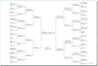 At this point you may want to go back to the "Choose Layout" tab to check out some more of the options and tweak your chart a little. First you'll want to choose a paper and size (discussed in a previous blog post) And then you'll want to choose a box style (also discussed in a previous blog post.) All of these choices are available in the editing panel on the "Choose Layout" tab.
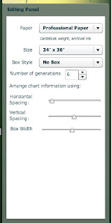 Now, you sharp readers out there will notice something in the editing panel that we haven't talked about previously. The "Arrange chart information using:" section. This section of the editing panel gives you control over how the chart is laid out. The first two slide rules are about the space between the boxes. And the last slide rule is about the size of the box.
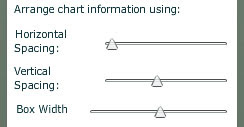 Let me show you some examples. First, with horizontal spacing, you can control the space between the generations like this:
wide:
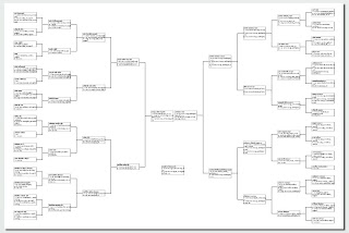 or tight:
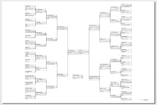 Then with the vertical spacing, you control the spaces within a generation like the wide ones above, or this tight one here: (remember, keep your eyes on the spaces between the boxes.
 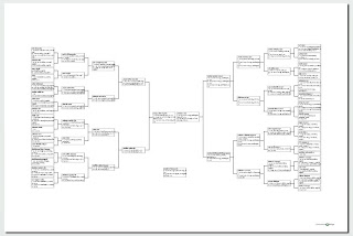 Between those two controls, you can shrink the chart size down to be able to use more of the space around it for decoration (below) or spread it out to take up all of the space on the chart.
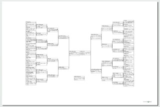 Then there is box width. On this same chart, when I widen the boxes, it actually also shrinks the height of the chart because there aren't as many lines of text wrapping down to the next line. Like this:
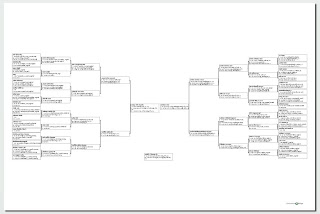 Or I can shorten the width of the box and create a chart that is taller, but has more room on the sides for pictures or decorations, like this:
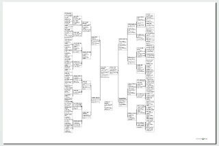 So you can see there is lots to play around with, even just on one style of chart. As you begin to decorate your chart, you can flip back and forth to be able to adjust the chart the way you want it. All sorts of options for your creativity.


No comments:
Post a Comment